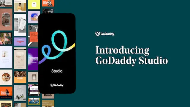
Rebranding An Iconic App Without Alienating Customers
After being acquired by GoDaddy, I led research into Over's rebranding efforts. As an app for creators, it was critical that they be involved in the selection of a new direction for the app.
“This icon is simple but really represents the brand’s creativity and the digital art that it helps bring out.”
— Qualitative feedback from an Over user
The Problem
The primary objective was to create a new logo that would seamlessly integrate with GoDaddy's other mobile apps without confusing Over's existing user base. The logo had to evoke the essence of a premium design app, a reputation that Over had carefully built over the years.
Methodology
Since our goal was to establish how the new logo performed across six key metrics, I decided to use a survey in order to gather statistically significant results.
This method also allowed us to slice the data by specific segments, showing how each of our customer personas might react to the proposed brand direction we were heading in.
I worked with the Strategic Director of the mobile team and the brand designer to identify and generate the stimulus we needed for testing.
After discussing it internally and talking with the larger marketing team at GoDaddy, I created a series of hypotheses that we wanted to test as part of the rebrand.
Because Over was primarily a mobile app, we decided that it was important to test how the new icon might perform in the Apple App Store and Google Play Store. The brand designer created several mockups of the proposed logos in context to make the study feel more realistic to our users.
I then worked with the Over team to turn our hypotheses into six key attributes that we could use to evaluate the new logo and app icon — simple statements that could serve as our North Star throughout the study.
Redesigns can be highly subjective, so these attributes helped us to rigorously evaluate the trade-offs we would be making.
In the study itself, we presented customers with one of the logo options we were considering and asked a series of questions to gauge their first impressions. Then we showed them all of the options and asked them to pick their favorite.
The study was designed iteratively, with time budgeted for three rounds of testing. This allowed us to refine the design and our questions based on user feedback and stakeholder input each time, eventually arriving at a very clear signal.

Iterative Testing
The first round of testing measured customer attitude towards the current Over app icon and branding. This allowed us to establish a baseline so that we could accurately measure any improvement across our metrics.
The second round involved a larger sampling of icon options, narrowing down to five based on both quantitative and qualitative feedback.
The final round focused on these preferred options, with one emerging as the clear winner, performing 73% stronger in preference testing than the second most popular design.

Examples of the brand assets and results. Note: For confidentiality, icons have been replaced with placeholders.
Socializing the Results
I shared the findings in a meeting with key stakeholders and we discussed the takeaways and limitations of the study. Special care was taken to evaluate how the perceptions changed across various demographics and segments.
With high confidence in the design direction, the brand designer and the marketing team took the winning concept and then refined it even further, paying attention the small details of the gradient and line shape.
I then met with the marketing team separately to discuss some of the more detailed findings from the study, particularly the qualitative feedback and demographics. This helped them to design a marketing campaign to highlight the strengths that users saw in the new icon and brand name.
Lessons Learned
Rebranding research is an intensely collaborative effort, involving people and teams from across the organization. An iterative study design can give a diverse group of stakeholders the opportunity to provide feedback and improves the quality of the study design.
Picking the core attributes we wanted the new brand to convey gave us confidence that we were moving in the right direction from both a marketing and strategy viewpoint.
View more case studies


Get in touch
Email: hello [at] patrickward [dot] io